
The UCSD Triton2GO mobile ordering app is an integral part of almost every UCSD student's life on campus. Our group of 3 has had some pretty crummy experiences with the app so when we were given the opportunity to fix it through a redesign, we were filled with motivation. In a little under 3 weeks we redesigned aspects of the current app to improve the user flow as well as the information architecture.


We decided on redesigning the spam can because many of us in the group had a loving relationship with the iconic home cooking staple, but more importantly we were easily able to brainstorm issues that we had encountered in the past with the packaging. We then brainstormed trade-offs and possible errors that other users might encounter in order to help guide our interview tasks and questions.

We conducted 16 interviews utilizing the master-apprentice model to ensure that the interviewees gave us authentic and accurate responses. The format of our interviews consisted of 3 parts, pre-task questions, tasks, and post-task questions.
Our pre-task questions were aimed at getting background info on the participants' demographics and prior experience with the product.
We focused our tasks on the most common ways people would naturally interact with the can so that we could get a clear look at how each user bridged the gulf evaluation and execution as well as reveal possible discrepancies among the user's mental model and the designer's conceptual model.
Finally, our post-task questions were a way for us to get specific answers to what the user thought was good and bad about the design and experience of the tasks. In addition, we were able to get early ideas on what the users would like to see redesigned and how. Data was collected, organized and analyzed using google forms and google sheets.
Below are some of the interview responses and results:

.png)

One user also responded:
"When you open it, I think its difficult to open, and you could also cut yourself on it because its thin, metallic, and sharp. It curls up really randomly like *makes sound effect* and might cut your hand. I would make the lid sturdier so its thicker and doesn’t twist up when removed."
Our initial redesign was a rough prototype which gave us a direction in which to address the issues discovered during the user tests. By leveraging our knowledge of user-centered design, we collaborated to come up with realistic solutions to the main issues we found by bouncing ideas around during a group zoom call. To create a collaborative and safe atmosphere, none of our propositions were rejected until we focused in and converged and agreed upon the best solutions.
Our main goal with our redesign was to maintain the shape and visual identity of the product while addressing the major issues we found above. We came up with the idea to use a flexible plastic lid (similar to a can of nuts) to make it easy for users to open and reseal in order to store leftovers. This 1 solution addressed 2 of our 3 main issues, opening the lid and reusability. For last issue, we wanted to signify to the user that the can affords squeezing in order to more easily release the spam from the can. This was done by adding large arrows telling the user to push the sides of the can.

As with all design endeavors, we knew that we wanted to iterate on our redesign since our initial prototype was only created to give us some direction on what we wanted to address.
After comparing the current product, our initial prototype and numerous other food packaging items, we discussed certain aspects of our design that we should keep, like the lid and overall shape and design language of the can, and others that we could change and improve upon. Our new redesign implemented features inspired from the other food packages that we examined.
These features included adding a better way for users to release the spam from the can by pushing from the bottom, similar to a push up popsicle. This method added a direct way for the user to get as much spam out of the can as they needed without having to vigorously shake the can, even if it was tension was released like in our initial redesign. It also makes more intuitive sense to push the spam out of the can rather than push to the sides and shake the spam out. Another small change we implemented was to add a thin plastic seal to brand new cans for quality assurance.

Due to the limitations of our project, we were unable to conduct any more user tests, however given the resources, we would have wanted to conduct more usability tests on our redesign in order to identify any possible issues or things that we could improve.
With this being my first big design project, this was my first experience going through the design process and coming up with feasible solutions to real issues. I was able to directly apply design principles such as signifiers and affordances in order to analyze existing products and create new ones. This project taught me about conducting effective user research, analyzing data to identify main problems to address, and how to iterate on our designs with a team to find a solution that was both realistic and effective. It also taught me about the limitations that designers may have to face when it comes to addressing issues while maintaining the product's identity or other reasons.
The value of a team cannot be overstated. Every project with a team teaches me something new about myself and how to work with others. In this case I learned the importance of letting everyone share their full ideas and providing an atmosphere where everything is accepted. This fostered creativity and thinking out of the box.
Our team all collaborated to create and conduct interviews, brainstorm ideas, and propose ideas for each stage of the project. My personal contributions included analyzing the patterns and trends of our interviewees in order to identify the main issues and proposing certain items to be included in the competitive analysis.
I would like to take this chance to thank my team members Pramit Mazumder, Emily Yu, Joel Tornero, Olivia Courvelle and Kaela Alagos. This could not have been done without you all.
Our 4 initial user interviews were aimed at getting to know some background information on the users as well as any of the current issues that plague the current design of the app. We made sure to include users familiar with the app as well as users who only had experience with other delivery app.
Our interviews consisted of some pre-task questions, aimed at getting to know the user's experience level with the app, some tasks to identify any common issues as well as some post-task questions to finish off the interview.
The main issues that we found with the current design of the app are as follows:


After identifying the main problem points of the current design, we performed a competitive analysis on some other popular food delivery apps to see how they addressed those problems.
Common things we found across Grubhub, Uber Eats, and Doordash:
• the abundance of images and thumbnails to help users choose what they wanted to eat
• filters to select what type of food to browse
• info about the restaurant and food items was also very easy to locate
• customizations to food items was condensed and straightforward
We used these solutions as inspiration for our sketches to redesign the Triton2GO app to improve and modernize it.
While there were more sketches, I have chosen only to include the 2 closest to our redesigns.

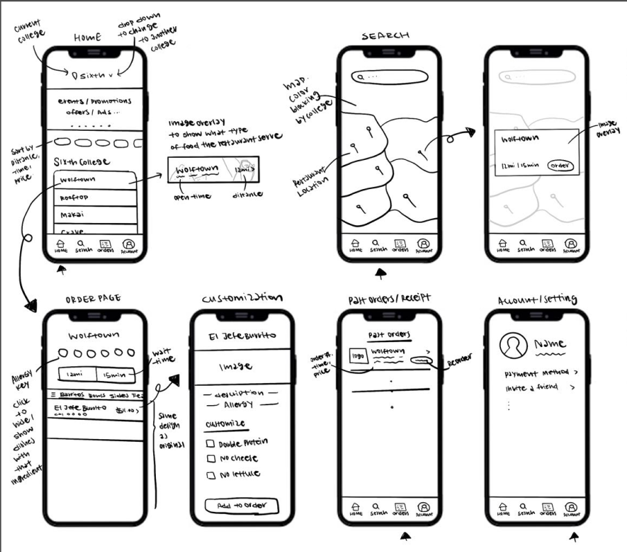
After we decided on what aspects we wanted to include in our redesigns, we moved forward and created 2 high fidelity prototypes in figma.

The home screen on our first redesign mimics the UI of the other popular delivery apps but with a few unique features.
Along with the common search bar and food categories, we included collapsible dining hall lists as well as a filter to help users sort by dietary restrictions as well as specific dining halls.
Filter items were given labels to help the user build a familiarity with what each icon means. Thumbnails and extra restaurant info were also added.
We kept the item categories and search button the same as the current app as that had no issues.
We added a way to filter items based on dietary restrictions which also serves to remind users what each icon means.
Thumbnails and food descriptions were added to inform users on what each item was as well as to help users find what they wanted to eat.
The multiple page process of customizing an order was also consolidated to a single page that was also easy to return to in case changes wanted to be made. This addressed the issue of having a bunch of unnecessary pages and actions to the ordering process.


For our second redesign we focused the home screen options to focus on filtering by the specific dining hall locations. A dropdown menu with options for each dining hall was implemented for this purpose.
A section was also added to promote special events which helps the app feel more involved in the state of campus.
The bottom navigation bar was also condensed to only show key features that users used the most.
As with the first redesign, thumbnail images were added for visual communication.
The user flow largely stayed the same between the prototypes, we just made sure that the UI elements had a consistent theme.
The customizations were also moved to a separate screen to help reduce clutter.

Using our 2 hi-fi prototypes, we conducted user tests on 4 new participants in order to evaluate the effectiveness of our designs. Interviews followed a similar structure as before with both pre- and post-task questions as well as tasks.
It was pretty much unanimous that our redesigns were preferred over the original, due to the UI improvements as well as the increased options for filters and customization. Many users noted that they felt that the images were a drastic improvement over the original design (because who doesn't like looking at food pics). They also felt that the filters were very helpful when trying to address their dietary needs.
Since both designs were so similar it was hard to identify a true winner when it comes to our redesigns. More user testing would be required to get a clear answer, however another direction that could be taken is to incorporate ideas from both into a new final design. Due to the constraints on this project, this was not possible, however given time and resources this would have been our next step. By giving both designs the exact same functionality, the only factor that users or stakeholders would have to decide upon is their preference on the visual style of the designs.
This project taught me a lot about how important visual communication is even when not using words. I also learned that while users may not initially notice poor efficiency, they very much appreciate it when features are in place to make things easier.
Of course working in a team always reinforces my interpersonal skills. Things like working around each others schedules and making sure all ideas are heard are always things that I get reminded about when working with a team. This was exemplified in the short time frame that we had to complete this project as well as part of it happened during Thanksgiving weekend. (The prototypes ended up being done in a day due to the way we scheduled our progress and meetings)
While we all worked together on the majority of the parts of the project, my personal contributions included some user testing in both phases, competitive analysis on GrubHub, some sketches and focusing on the home screen, filters and some of the prototyping for the hi-fi prototypes.
I would like to take the chance now to thank my team members Jonathan Yip and Cary Cao. Y'all are real ones.
In order to help Audrey's convey their brand we created brand new home and about pages utilizing elements from Dr. Seuss's creations. We also included a rewards page for returning users to easily track their progress. Our menu and checkout designs will be showcased in a later section.


Our first priority was getting in touch with the Café Lead, which was not difficult as the establishment is located on campus. We conducted an interview about necessities, clientele information, business logistics, and what makes Audrey's brand unique. We also showed them various competitor sites to help us evaluate things worth including and avoiding. With this information, our team synthesized the following priority list of objectives.

Another big point that was mentioned by the Café Lead was the need to emphasize Audrey's unique brand. Our team pinpointed these 3 main aspects that makes Audrey's beloved by many students and faculty alike.

Once aware of our client's goals and needs for the website, we created an interview guide in order to find out the needs and wants of our potential users. To do this, we interviewed 9 individuals about some general information, their ordering habits, what other competitors do that Audrey's doesn't, and potential features for Audrey's new website.
After collecting the data, we analyzed it by grouping together users who had similar answers and displayed similar characteristics in order to create a general persona for each group.


Our next steps consisted of brainstorming 2 scenarios per persona and then coming up with multiple use cases for each scenario. We summarized the use cases into a table to see what types of features would best address each case. These features and functionalities are summarized in the table shown, along with who the features are designed for.

We then wanted to see exactly how other popular coffee cafés in the area were able to effectively convey their unique brands and what features they implemented to make their website enjoyable to use. These competitors consisted of Starbucks, Better Buzz, Philz Coffee, Blue Bottle and Peet's Coffee.

Our key takeaways from the way each competitor portrayed their brand are listed below.
The functionality of each website was summarized in the following table.

The site architecture and content of each competitor was also analyzed. From that, we came to the following conclusions.
We took inspiration from the comfy atmosphere cafés typically evoke as well as the unique brand of Audrey's being Dr. Seuss's wife to construct a moodboard with images depicting delicious coffee and Dr. Seuss's wacky art style.

Our style guide consisted of the Audrey's Café logo, their brand colors as well as the font we chose. Our initial font choice was Roboto, as it is a very safe and basic font to choose, however after we received feedback that it was a bit boring, we decided to change the font to Lora, which mimics the font used in Dr. Seuss's books.

After our competitive analysis and user research, we now had a list of pages and features that we wanted to include in our site. Using this, we created the following diagram to lay out our site architecture and possible user flows.

Using this, we sketched out some lo-fi screens to help us visualize the UI for the website. Our designs were pretty conventional for the most part so for the sake of brevity, I have omitted the sketches. (Reach out if you would like to see them!)
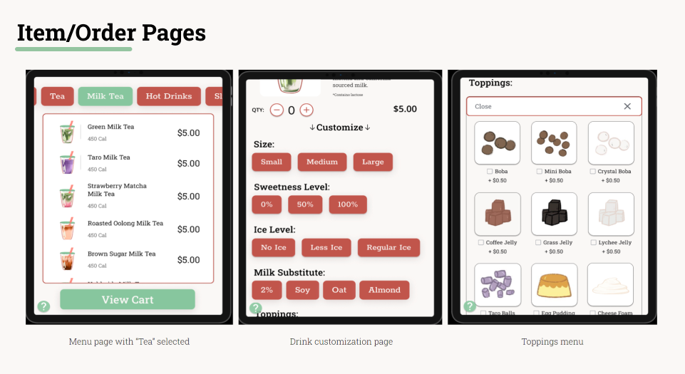
One of the big challenges we encountered when sketching revolved around how we wanted our menu screen to look. We initially sketched the following 3 designs.

After presenting these sketches to the client and 2 users, we found that it was best to display all the items at once, rather than having buttons that bring you to a new page or an expanding list. This lead us to choose the first sketch to build out in our prototypes.
However, we were not quite done with making changes to menu quite yet. Jumping ahead a little in the timeline, after we completed our initial prototype, we found that the menu layout felt a bit crowded and the small size made it hard to make the item thumbnails look interesting/tasty.
After more brainstorming, came to the conclusion that 2 items per row for each of the 7 categories made the most sense and that we could add a filter bar at the top to help users navigate to their desired category.
Later usability testing showed that this change increased conversion rate for specialty drinks by 34%.

Another speedbump we ran into was how the filters bar worked. Our initial prototype had the currently selected filter shuffle to the front of the list to give another visual cue that signifies which tab the user navigated to.
However this only served to confuse the users as 5/5 users expressed this sentiment. One user stated, "shuffling is very confusing and not intuitive."
It is worth noting that was not an issue in the desktop version, likely because the full list of tabs was visible at all times, as opposed to the mobile site.
To change this, we decided that a filter bar that remained in the same position was best, as it reduced confusion and many users felt that this was more intuitive. This approach helped users develop their own mental structure of the menu so that returning users could more easily find their desired filter.
This decreased task completion time by an average of 46% across all users.
We also darkened the unselected tabs' background for better readability based on other users' comments.

After solving these major issues and further iterating and refining small parts of the site, our mobile and desktop prototypes for Audrey's new website were given to the Café Lead, who was very satisfied with how we portrayed Audrey's brand through visual elements as well as the improved functionality of the site.
(Hover to zoom in)


This was my first project of this scope and I definitely learned a lot about when it comes to working with an actual client as well as making sure that progress is communicated effectively. Some key takeaways are:
Although the client expressed great satisfaction with our design for the new site, we were later notified that due to UCSD Bookstore logistics that our designs were unable to be implemented and a new site would not be created. Despite this unfortunate news, this project gave me valuable experience when it comes to designing a product for an actual client.
I would also like to take this space to thank my teammates Jonathan Yip, Cary Cao and Yifei Zhang who all played an instrumental role in the success of this project.
Personal Contributions include but are not limited to: Mobile Screens (Home, About Us, Sign In, Menu, Item), Competitive Analysis on Better Buzz, UI Changes, Prototyping Mobile Interactions
The market for boba within the US is a rapidly growing industry and especially among college students, “boba runs” have introduced a new type of hangout culture. From personal experience and observation, many of us have noticed the efficiency of ordering from an interactive kiosk and the noticeable lack of kiosks in various boba locations (although some do have them but the UI is also not always intuitive). Our group of boba lovers applied our skills as student designers in order to prototype our own boba-ordering experience.
We conducted both online research and field observations to analyze the current impact of kiosks on the market and user base. Our online research is organized by positives and negatives while our fieldwork summarizes observations of the demographics and interactions between customers and kiosks.


By synthesizing data from our research, we came up with 2 user personas that captured our target audience for the kiosk. One was a busy college student who needs a fast way to fit a boba run into his hectic schedule and the other was an older father who is not very tech literate and wants to order something for his children.


Using these personas we came up with various scenarios that these people would likely encounter when coming to our store and sketched up some storyboards to help visualize their reactions and emotions. These storyboards would later be used during our user interviews.


Utilizing our storyboards and research data, our team created a interview plan focused on getting participants to share their personal experiences with self-service kiosks. After recording voice memos of our recordings, we tagged and coded each interview using the Dovetail software.
Many users valued reduced face to face interaction, increased efficiency and also order time approximation features. Our findings are summarized in the following visualization:


Our next step involved creating a user flow to outline how users would interact with the kiosk and navigate through its features.


We then sketched out various ideas for both the interface layouts and for the physical construction of our kiosk. Inspiration for interface elements and what should be included were taken from other kiosks observed during competitive analysis and adapting it to our fictitious menu.


Using our sketches from the previous step, we put together several wireframes with very basic navigation included in order to get some peer feedback. Our main concern for this phase was determining which layout would the most suitable for our menu pages, given the amount of information that needs to be displayed.
After considering peer feedback, the necessary elements of the pages and our team’s design goals, we agreed upon a layout which displayed the drink categories horizontally on the top of the page with the menu items given their own row to display various pieces of info about it.

Our group started brainstorming ideas with a moodboard that showed off the general vibe, color palettes and adjectives that described our vision for the establishment. On a whim, we named our group the Goofy Goobers after an ice cream restaurant in Spongebob Squarepants. We changed the image of Walter the waiter in the peanut costume to a boba hat and used him as our main branding element which also helped inform our color choices.
(This was a class project so copyright issues were not taken into consideration)


Below is the full high fidelity prototype, including tutorial pages that were not included in our previous wireframes.

Here are some of the key features from this prototype.


Our final round of user testing consisted of our group scouting out willing participants hanging around the local boba shop on campus. We were able to interview 4 users with ages ranging from 19 - 60 years old asking some background questions about their familiarity with boba and interactive ordering kiosks and observing them completing a number of task and playing around with our kiosk. (Full interview guide and recordings can be provided. Just shoot me an email :) )
From these tests, we were able to identify a number of positive trends as well as some areas that were lacking.

Based on our findings from the user testing sessions, our future considerations would include:
My key takeaways from working on this boba ordering kiosk are as follows:
I now want to thank the other amazing Goobers who helped make this project succeed. Thomas Wang, Viviana Balladares, Joanne Tsai, and Ryley Aimer-Ghani, you guys are awesome, couldn't have done it without y'all.
Personal Contributions include but are not limited to: Data collection/analysis, wireframe creation, hi-fi creation, prototyping interactions and physical construction of chassis including inkscape layout and laser cutting.


